Website Conversion Checklist for More Enquiries

A website can look respectable, show up in Google and still quietly lose enquiries every week. The usual problem is not that visitors cannot find the business. It is that, once they arrive, they are given too little reason or too much effort to take the next step. This website conversion checklist helps local service businesses identify where that friction is coming from.
Conversion is not about tricking people into clicking a button. It is about making it easy for the right customer to understand what you do, trust you and get in touch. For a plumber, accountant, beauty clinic or specialist trade, that often means more calls, quote requests and booked consultations – not more meaningless website traffic.
Start with the customer journey, not the homepage
Most owners review a website from the perspective of someone who already knows the business. A potential customer does not have that context. They may have found you while comparing three local firms on a phone, between jobs or late in the evening, and they will make a quick judgement.
Open your site on a mobile phone and ask three basic questions: What does this business do? Is it relevant to my area or problem? What should I do next? If the answers are not obvious within a few seconds, the rest of the page has to work much harder than it should.
Your main message should state the service, the type of customer you help and the location or service area where relevant. “Quality solutions for every need” says very little. “Reliable boiler repairs across Dunfermline and Fife” gives a visitor something useful straight away.
Website conversion checklist: the essentials
1. Make the primary action impossible to miss
Every key page needs one clear next step. That may be “Request a quote”, “Book a consultation” or “Call for availability”. It should be visible near the top of the page and repeated naturally once a visitor has had enough information to act.
A common mistake is offering too many equal choices: call us, email us, download a brochure, follow us, read the blog and browse the gallery. Those options may all have a place, but they should not compete with the action that generates business.
Use specific wording. “Submit” is functional but vague. “Request your free quote” tells people what happens when they click. The promise must be genuine, of course. If a form says you will respond quickly, make sure someone is responsible for doing so.
2. Check whether mobile visitors can contact you easily
For many local businesses, mobile is where first impressions and enquiries are won or lost. A site that looks polished on a desktop but makes people pinch, zoom or hunt for a phone number is costing the business customers.
Test the essentials yourself. Can you tap the telephone number to call? Does the contact form fit comfortably on the screen? Is the main button easy to reach without scrolling through a large banner? Do maps, galleries and pop-ups behave properly?
There is a trade-off here. Large visuals can help a premium service feel credible, but not if they delay the page or push the useful information out of sight. Mobile design should favour clarity and speed over decoration.
3. Remove unnecessary friction from forms
A long enquiry form is rarely a sign of professionalism. It is more often a barrier between a ready customer and a conversation. Ask only for what you need to make an initial response useful: name, contact details, the service required and a short message are normally enough.
If your work genuinely requires more detail, explain why. A builder may need a property postcode, project type and rough budget before arranging a site visit. That is reasonable when it helps qualify the job. Asking for those details on every enquiry, however, can reduce submissions from people who are still deciding.
After a form is sent, show a clear confirmation message. Let people know when they can expect a reply and what will happen next. Silence after an enquiry creates doubt, even when the form has worked perfectly.
4. Put proof next to the claims
Visitors are cautious for good reason. They have seen vague promises, stock photography and five-star reviews with no context. Your website needs evidence that the business is credible and capable.
Use real customer testimonials, recent project photographs, qualifications, accreditations, years in business and recognisable local experience where they are relevant. A short testimonial is stronger when it names the service delivered and the result achieved. “Great service” is pleasant. “They redesigned our kitchen around a difficult layout and finished when they said they would” is more believable.
Do not bury this proof on a single testimonials page. Place it close to the service it supports. Someone considering emergency electrical work wants reassurance on that service page, not a task to complete later.
5. Explain your services in the language customers use
Service pages often underperform because they are written around internal labels rather than customer needs. A visitor may not search for your preferred industry term. They search for the outcome they need: a leaking roof fixed, payroll managed, family photographs taken or a garden redesigned.
Each major service deserves enough explanation to answer practical questions. Describe who it is for, what is included, what makes your approach different and how the process works. Where pricing varies, do not pretend otherwise. Explain what affects the cost and invite people to request a tailored quote.
This also supports local SEO. Google needs clear signals about your services and areas, but those signals must read naturally for human visitors. Repeating town names without useful context does not build trust or rankings.
6. Make your contact details feel real and current
A local business should not feel anonymous online. Display a working phone number, business email address, service area and opening hours where appropriate. If customers visit your premises, provide the address and practical directions. If you work at customer locations, say so plainly.
Inconsistent details can damage confidence. Check that the phone number on your website matches your Google Business Profile and social profiles, and that old email addresses or former locations have been removed. These are small details, but customers notice them when they are deciding whether to trust a business.
7. Measure the actions that matter
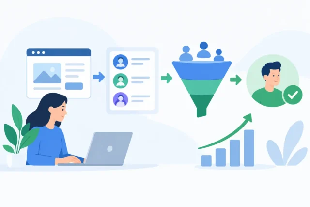
Website traffic alone is a poor measure of success. A busy website that generates no worthwhile enquiries is not doing its job. Track form submissions, telephone clicks, appointment requests and email clicks so you can see which pages contribute to real leads.
Then look beyond the total. If one service page gets plenty of visits but few enquiries, the issue may be weak messaging, slow loading, unsuitable traffic or a call to action that appears too late. If a page gets fewer visits but regularly produces good leads, it may deserve more SEO and advertising attention.
Numbers need context. Ten enquiries are not automatically better than four if most are outside your area, below your minimum job value or unrelated to your services. The goal is qualified opportunities your business can serve well.
8. Test speed, links and basic confidence killers
Slow pages, broken buttons and outdated content make a business appear less dependable, whether or not the service itself is excellent. Check the site regularly after updates, especially on mobile devices. Test the navigation, enquiry forms, telephone links and key service pages.
Review the details that date quickly: team information, project images, prices, opening hours and seasonal offers. Remove old notices and expired promotions. A page mentioning a past event from two years ago tells visitors that nobody is looking after the site.
This is also where professional WordPress maintenance matters. Updates, backups and security are not glamorous, but a broken contact form or compromised site can stop enquiries without warning.
Prioritise the gaps that affect revenue first
Do not try to rebuild everything because you found a few weak points. Start with the pages that receive the most visits or represent your most valuable services. Fix an unclear headline, weak contact route or cumbersome form before debating minor colour changes.
A conversion-focused website is never truly finished. Customer questions change, services develop and competitors improve. The sensible approach is to review the journey regularly, make evidence-based improvements and keep the site aligned with how your business actually operates.
If you are unsure where enquiries are being lost, a practical website review can provide a clearer starting point than another round of guesswork. At MonoWeb, that means looking at the points where local customers decide to stay, contact you or leave – then focusing effort where it can make a commercial difference.
More Posts
 Website Tips
Website Chat Versus Forms: Which Wins Enquiries?
21 September 2026- Website Tips
How to Track Website Leads That Become Customers
20 September 2026 - 19 September 2026