Website Accessibility for Small Businesses
A potential customer has found your business, landed on your site and is ready to enquire. But the text is too faint to read, the booking form cannot be used with a keyboard, or a video explains a service without captions. They leave – not because they do not need what you offer, but because your website made the next step harder than it should have been.
Website accessibility for small businesses is often treated as a technical extra. It is not. It is part of providing a usable, credible service to the people you want to work with. For a local business, that can mean more completed forms, more phone calls and fewer customers choosing the competitor whose website is simply easier to use.
Accessibility is a commercial issue, not just a compliance task
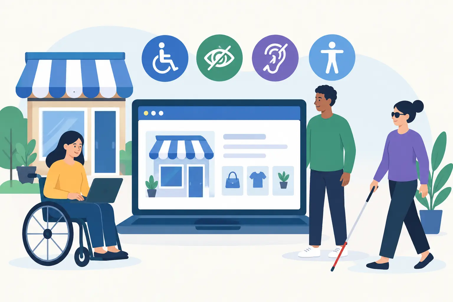
Accessibility means designing and building a website so people with different access needs can use it. That includes people who are blind or partially sighted, deaf or hard of hearing, have limited mobility, are neurodivergent, or use assistive technology such as screen readers and keyboard controls.
It also helps far more people than the label suggests. A customer may be reading your site outside in bright sunlight, using one hand while carrying a child, recovering from an injury, dealing with a poor mobile connection or simply struggling with a confusing form. Good accessibility removes unnecessary friction for all of them.
For service businesses, the commercial link is direct. If someone cannot find your phone number, understand what you do, read your pricing information or submit an enquiry, your website is costing you work. A polished homepage does not make up for a customer journey that excludes people at the point of contact.
There is also a legal consideration. In the UK, the Equality Act 2010 requires service providers to make reasonable adjustments so disabled people are not put at a substantial disadvantage. What is reasonable varies by business and circumstance, so accessibility should not be approached as a box-ticking legal guarantee. It is, however, a sensible risk-reduction measure and a clear sign that your business takes customers seriously.
Where small business websites commonly fall short
The most damaging accessibility problems are usually not dramatic design failures. They are everyday shortcuts that go unnoticed until a customer cannot use the site.
Low-contrast text and unclear visual design
Light grey text on a white background may look understated on a designer’s screen, but it can be difficult or impossible for many visitors to read. The same applies to text placed over busy images, tiny type on mobile screens and buttons that do not look like buttons.
Your brand colours still matter. The answer is not to abandon them, but to use them with enough contrast where customers need to read, choose or act. Important instructions should not rely on colour alone either. If a form field has an error, explain the error in words rather than only marking it red.
Forms that create a dead end
An enquiry form is often the most valuable page element on a local service website. Yet many forms use vague labels, unclear required fields, error messages that disappear too quickly, or CAPTCHA checks that frustrate genuine customers.
Every field should have a clear label, not just placeholder text that vanishes once someone starts typing. Tell people what will happen after submission and provide a phone or email alternative. If your form asks for more than is needed to begin a conversation, reduce it. Long forms lower conversion rates for everyone, not only visitors with access needs.
Navigation that only works with a mouse
Some visitors navigate using a keyboard rather than a mouse or touchscreen. They should be able to move through menus, buttons, forms and pop-ups in a logical order, with a visible indicator showing where they are on the page.
This is an area where flashy effects can cause real damage. Complex animated menus, auto-playing carousels and pop-ups that trap users can look impressive in a pitch but make the site slower and harder to operate. If an effect does not help a customer understand your service or get in touch, it is usually not earning its place.
Images and video with no useful alternatives
Images need alternative text when they communicate useful information. A photo of your team may only need a brief description. An image showing the stages of a roofing repair or the features of a product needs text that conveys the relevant point.
Alternative text is not a place to cram in search terms. It should describe the image’s purpose in context. Decorative images can be ignored by screen readers, while important images should not leave the visitor guessing.
Videos should have accurate captions. If the video contains essential visual information that is not spoken aloud, a written description or supporting text may also be needed. This improves access and gives busy visitors another way to absorb the information.
Practical accessibility improvements with the biggest return
You do not need to rebuild every page overnight. Start with the pages that generate enquiries: your homepage, core service pages, contact page, booking journey and any checkout or quote process.
A practical first review should cover these areas:
- Check text size and colour contrast on desktop and mobile, particularly buttons, links, prices and form instructions.
- Try using the site without a mouse. Press Tab and ensure you can reach every important link, menu item and form field.
- Read your main pages on a phone at 200% zoom. Content should reflow without forcing users to scroll sideways.
- Review every enquiry form. Use clear labels, plain-language error messages and only essential fields.
- Add meaningful alternative text to important images, captions to videos and descriptive names to buttons such as “Request a plumbing quote” rather than “Click here”.
These changes are not glamorous, but they are valuable because they improve the route from interest to enquiry. They also tend to support better mobile usability, clearer content and stronger trust signals.
Accessibility and WordPress: the platform is not the whole answer
WordPress can support an accessible website, but it does not make one automatically. A well-built theme, sensible page structure and carefully selected plugins provide a good foundation. Poorly chosen themes, drag-and-drop widgets and plugin-heavy builds can introduce inaccessible menus, weak heading structures, duplicate links and slow pages.
This is why the build process matters. Accessibility needs to be considered while deciding the page layout, writing button labels, selecting colours and setting up forms – not added as a quick repair after launch.
For example, headings should follow a logical order. A page should not jump from a main heading to a smaller heading because it looks visually neat. Screen-reader users rely on that structure to scan the page. The same principle applies to buttons, error messages and pop-ups: the underlying code and content choices matter as much as the visual design.
Automated accessibility checkers can identify useful issues, including missing image descriptions and contrast problems. They cannot tell you whether a form makes sense, whether a service page is written clearly or whether a keyboard user can complete a key task without confusion. Use automated checks as a starting point, then test real journeys yourself.
Avoid the quick-fix accessibility overlay
You may have seen tools that promise to make any website accessible by adding a small icon to the corner of the screen. These overlays can appear attractive because they are cheap and quick. The problem is that they rarely fix the underlying barriers in the website’s code, content or forms.
In some cases, they add another interface for users to navigate and create a false sense of security for the business. If a customer cannot use your enquiry form, an accessibility toolbar will not necessarily solve it. Fixing the source of the problem is more reliable and usually improves the website for every visitor.
Make accessibility part of normal website maintenance
Accessibility is not a one-off project because websites change. New service pages, staff photos, booking tools, videos and seasonal offers can all introduce new issues. The good news is that once your team has a simple process, the work becomes routine.
Before publishing a page, ask whether the content is easy to read, the headings explain the page, images have suitable descriptions and the call to action is clear. When adding a form or third-party booking tool, test it on mobile and with keyboard navigation before sending customers towards it.
If you work with a web designer or developer, ask direct questions. Will they test forms and navigation with a keyboard? Will the site meet recognised accessibility standards where practical? Can they explain what has been checked in plain English? A capable supplier should be comfortable answering without hiding behind jargon.
A website should not ask customers to work harder than necessary to give you their business. If you are unsure where the barriers are, a focused website review can reveal the issues affecting accessibility, enquiries and trust – then give you a sensible order for fixing them.
More Posts
 Website Tips
12 Best Lead Generation Tools for Local Firms
16 September 2026- 15 September 2026
- Website Tips
Customer Journey Mapping Guide for Local Firms
14 September 2026