What Are the 7 C’s of a Website? A Practical Check

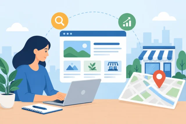
A website can look polished and still cost a business enquiries. If visitors cannot quickly understand what you do, trust you, find the right service or take the next step, the design is not doing its job. So, what are the 7 C’s of a website? They are a practical framework for judging whether a website works as a business asset, not simply as an online brochure.
The original 7 C’s framework was developed for online customer experience, and different people occasionally use slightly different versions. The most widely recognised model covers context, content, community, customisation, communication, connection and commerce. For a local service business in Fife or across Scotland, each one should support a straightforward outcome: helping the right person become a qualified enquiry.
What are the 7 C’s of a website?
The seven C’s are not a design checklist to tick off at the end of a project. They should shape the site from the start – from its page structure and wording to its mobile performance, contact process and follow-up. A weak point in one area can undermine the others. Excellent photography, for example, cannot compensate for a confusing service page or a contact form that does not work properly.
1. Context: how the website looks and works
Context is the structure, layout and practical experience of using your website. It includes navigation, page hierarchy, visual design, loading speed and how well everything works on a phone.
For a plumber, accountant or beauty clinic, context should make the next move obvious. Visitors need to see the service they need, the area you cover and how to contact you without hunting through a menu. On mobile, that may mean a clear call button, short sections of text and a prominent enquiry option.
A common mistake is prioritising visual novelty over clarity. Clever animation, oversized video and complicated navigation may suit a large brand campaign. They are often a poor trade-off for a local business website if they slow the page down or hide key information. Clean, familiar and fast usually wins.
2. Content: the information that answers buying questions
Content is every useful word, image, case study, service description and supporting detail on the site. It should explain what you offer, who it is for, why a customer should choose you and what happens next.
Thin content is one reason service websites struggle in Google and with real people. A page titled “Our Services” followed by a few vague sentences gives search engines little to understand and customers little reason to act. A dedicated page for each important service is normally stronger, particularly when it covers the problem, the process, likely outcomes and relevant local areas naturally.
Good content does not mean filling pages with jargon or writing for algorithms. It means being specific. Instead of saying you provide “quality solutions”, say what you repair, build, advise on or deliver. Add evidence where it helps: qualifications, years of experience, project examples, service boundaries and answers to common concerns.
3. Community: proof that people trust you
Community refers to the ways people connect with your business and with each other. For many local service firms, this does not mean building a busy forum. It means showing that your business is established, active and trusted in the real world.
Reviews, testimonials, before-and-after examples, local projects and genuine team photos all contribute. A strong testimonial is more than “great service”. It identifies the customer’s problem, what your business did and the result. That is useful social proof for someone deciding whether to make contact.
There is a balance to strike. A website does not need a social feed on every page, and automated feeds can make a page slower or look neglected when posts stop. Use community signals where they add confidence, not as decoration.
4. Customisation: making the journey relevant
Customisation is about giving different visitors a route that makes sense for them. On a large ecommerce site, this might include personalised product recommendations. On a local business website, it is usually simpler and more valuable: clear pathways by service, customer type, location or urgency.
A solicitor may need separate routes for family law, wills and business clients. A trades business may need an obvious distinction between emergency repairs, planned work and commercial contracts. Someone who lands on the right page is more likely to enquire because they do not have to translate generic messaging into their own situation.
Do not overcomplicate this. Most small businesses do not need expensive personalisation technology. Well-organised service pages, clear navigation and enquiry forms that ask the right initial questions achieve much of the same result.
5. Communication: making contact easy and dependable
Communication covers how visitors speak to you and how your website responds. It includes phone numbers, contact forms, email confirmations, live chat where appropriate, booking tools and the expectations you set around response times.
This is where promising websites frequently lose leads. A form that sends messages into spam, a hidden telephone number or a vague “get in touch” button creates friction at the exact moment a customer is ready to act. Every enquiry route should be tested regularly, especially after website updates.
The right approach depends on how your business operates. A sole trader working on-site may prefer short forms and a request-a-callback option. A consultancy may benefit from a booking calendar that filters out unsuitable appointments. What matters is that the route feels easy for the customer and manageable for your team.
6. Connection: supporting the wider customer journey
Connection means linking your website sensibly to the places, tools and information that support a customer decision. This can include Google Business Profile details, map information, social channels, booking systems, payment tools, email marketing and relevant partner services.
It also applies to internal connections. A blog post about boiler servicing should lead naturally to the boiler service page. A case study should point visitors towards the service that produced the result. These connections help visitors continue their journey instead of reaching a dead end.
Be selective. Sending people away from your website too early can weaken conversion. External channels should reinforce trust or make action easier, while your main service pages should remain focused on turning interest into an enquiry.
7. Commerce: turning attention into business
Commerce is the transaction element of the website. For an online shop, that means product pages, baskets, checkout and payment. For a service business, it more often means the conversion process: requesting a quote, booking a consultation, calling for urgent work or submitting an enquiry.
A visitor should not have to guess what to do next. Each important page needs a relevant call to action, such as “Request a quote”, “Book a consultation” or “Call for emergency help”. Generic buttons can work, but specific wording tends to set clearer expectations.
Commerce also means reducing uncertainty. Explain whether consultations are free, which areas you cover, what information you need for a quote and when customers can expect a reply. You will not remove every question before someone contacts you, nor should you try to. You are giving serious prospects enough confidence to begin the conversation.
Using the 7 C’s to review your own website
Start with a simple test. Open your website on a mobile phone and look at it as if you have never seen it before. Within a few seconds, can you tell what the business does, where it works and what action to take? Then test the enquiry route yourself. If the experience feels slow, unclear or awkward, it will feel the same to potential customers.
Next, review your highest-value service pages. Check that each has useful, original information; evidence of trust; a clear path to contact; and a sensible place in the wider site structure. You do not need to rebuild everything at once. Fixing a weak call to action, an unclear service page or a broken form can have a more immediate commercial effect than changing colours or adding another homepage banner.
A good website earns its place in the business by making it easier for local customers to choose you. If you are unsure where yours is losing people, a professional website review can identify the gaps before they become another year of missed enquiries.
More Posts
 22 October 2026
- Website Tips
How to Automate New Customer Enquiries Well
21 October 2026 - Business tips, Website Tips
How to Reduce Missed Appointments for Local Firms
20 October 2026